Monday, January 30, 2012

Tools palette customization: This tool arranges your favorite tools into one easy section to get to. It's so easily organized and easy to get to.

Burn tool: The burn tool is used for naturally darkening a certain part of the image. It gives the darker, more mellow feeling.

Sponge tool: The sponge tool takes away any part of the image that you don't want. You could also add color or add stuff.

Clone stamp tool: It duplicates any part of the image or enhances a part. It also retouches parts of the image.

Versions: This tool is to skim through different versions of each image. You could do different edits on each image and then look at them through the timeline.

Full screen: So you can work with no distractions in a big screen. You could have every application in full screen and switch through them.

Auto Save: This tool automatically saves your work. It will save everything that you have done so you don't have to manually save the document. And so you don't loose everything you've done.

Getting pixelmator: You can edit your pictures with pixelmator. This is useful because you can edit any picture you want and do anything you want with it.

Dodge tool: to naturally lighten certain parts of the image. You can brighten darker parts and even brighten already bright parts of the image.

Smudge tool: To smeer paint, skin tones or whatever. You can make special effects with it, distortion and taking out hard edges to a subject.

Healing Tool: Touch up blemishes and wrinkles. You can also just get rid of a part of the image.

Eyedropper Tool: The eyedropper tool takes colors from the image. You can use that color whenever you want now.

Red Eye Tool: This tool easily gets rid of the red eye. Makes the image look more natural.

Layer Groups: Organizing a very busy image. You can group them into different categories or whatever order you want.

Cropping: To get rid of certain parts of the image. It easily focuses your attention to whatever part you crop.


Exporting images: This tool exports images to different formats for different uses. You can export the image to documents to use somewhere else.

Opening images: This may be helpful to edit your images. There are many different ways to open a picture so you can use whichever one is more convenient.

Polygonal lasso tool: This tool selects a part and adds effects. You can select the object or a part of the image and remove it or cut a certain part out.

Magic wand tool: This tool selects parts of your image. You can add special effects or take it out.

Marquee Tool: This tool selects parts of your image in a rectangular shape, elliptical or column Shape. You can edit the part you selected afterwards.

Lasso Tool: Allows you to draw the part you want to select yourself. Then allows you to edit that specific part.

Gradient tool: This allows you to fill the image with colors. You could do it on multiple layers and you can have multiple colors.

Unwanted Background: You can remove parts of the background that you do not want. It's helpful if there is a part of the image that is not desirable.


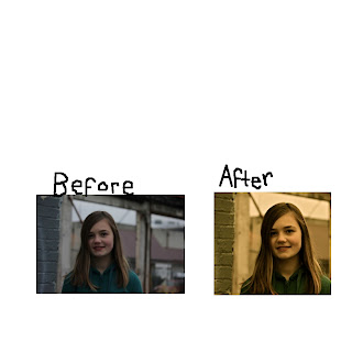
response from the article: I do agree with the article completely! After I saw the examples of the stuff he was talking about, I did agree. I thought that I did blur the face a little bit too much. I think I could have made the picture look a little bit warmer and not so much cold. I definitely thought that I shouldn't have changed the post. Now that I look at it, it looks funky.

Monday, January 23, 2012


Before


After


I learned how to use a mask. And also how to delete parts of it and putting it on any part of the image you want. I also learned that you could remove pimples, any type of ring or anything on the image you don't want. I learned how to make the skin on a person look all the same and kind of soft-ish. I thought that was really cool.

I also learned how to use curves. I thought that was really cool because I never knew how to do that. I think that it is really important most of the times too.

Tuesday, January 17, 2012


Image 4) I intended this image to be a shadow image. I at first didn't think it was good because it's shadow wasn't dark enough. Also it didn't look nice enough. I made some edits and made it better. I think It looks good.


Image 3) This image is a serious picture. I aimed for something kind of sad and not really smily or cheery stuff. I wish I would have made it a little bit darker. I think it turned out really good.


Image 2) This image is supposed to be a close up. I imagined it closer but I didn't because it didn't look good. I think it turned out a okay. I wish I would have taken it closer. I think its pretty.


Image 1) I wanted to to use backlighting for this picture. It turned out pretty well. I think the brightness is a little bit too bright. Although I did brighten her face to help it but it didn't turn out the way I thought it would. I had originally planned it to have the sunlight go through her hair on the right side and kind of shine on her face.


Monday, January 16, 2012

What I learned: I learned that You could have a couple different textures to a picture and It would still look good. You can match up the texture of the subject and the background. If you over-expose the picture it makes the image look smooth and relaxed. If you under-expose the image looks serious and draws attention to the light part.

I also learned, You could pose really crazy and have the picture still look good. I think it would be really fun to go out and take pictures of the culture around me! I really think the shadows look cool. I think the shadow is even more eye-catching than the actual subject is sometimes. I thought that the movement picture was really cool. Even if you can't see the subject very well, it still looks really cool. I really like the serious pictures. I learned that you don't always have to have something cheery in you photo.

Monday, January 9, 2012

What I learned: I learned how to make the image smaller using preview. It really helped because the image was way too big to be put in pixelmator. I learned different editing tools on pixelmator and Iphoto. Mostly on Iphoto. I learned to change the contrast, Saturation, highlights and shadows! It was really fun. I also learned what a vignette was. It's a shadow around the edges.


Monday, January 2, 2012


My second article I read is composition. I got confused in the beginning because I didn't know what the rule of thirds are. I kept on reading and I started to understand what he/she was talking about. The first step was really easy to understand. I got it right off the bat.

Number two I got confused on. One because it said the picture was balanced but it didn't look like it. but I got the balanced color part. number three I got it because it was kind of like the first article that we read. number four was really easy to wrap my mind around because the lines did give depth. I can imagine it and see it in other pictures. Number five I got because you just need to ask yourself what your doing and what could make it better.
the first article was beginning photography. I thought that it really did make a difference if you were standing really close and really far away. The trick he taught him to tilt the camera a little bit down was really cool. I think it is really fun to see the differences when you make one thing in focus in one picture and the whole picture in focus on the other.

I thought it was really cool how he could tell someone that much in so little time. I thought the way he showed the guy with the examples was really helpful (at least to me it was). I like how he explained what he was doing wrong and what he could do to make it better. I thought it was nice of him to help the guy. I thought the tips that he gave were important for anybody.